The Little Theatre
The Little Theatre
The Little Theatre
Celebrating 90 years with a fresh website!
Celebrating 90 years with a fresh website!

Project Overview
The Challenge
The Challenge
The Challenge
My challenge was to find a local business and revitalize its website. I chose the Little Theatre of Alexandria, a community theatre in Virginia, and set out to explore how I could enhance its online presence—especially in celebration of its 90th anniversary.
My challenge was to find a local business and revitalize its website. I chose the Little Theatre of Alexandria, a community theatre in Virginia, and set out to explore how I could enhance its online presence—especially in celebration of its 90th anniversary.
The Goal
The Goal
The Goal
I had a few key goals for this project. One was to gain a clear understanding of the services the Little Theatre of Alexandria offers and determine what needed to be highlighted on the site. Another was to completely refresh the design and overall look, allowing the theatre to better compete with both larger, well-known companies and other local theater groups.
I had a few key goals for this project. One was to gain a clear understanding of the services the Little Theatre of Alexandria offers and determine what needed to be highlighted on the site. Another was to completely refresh the design and overall look, allowing the theatre to better compete with both larger, well-known companies and other local theater groups.
The Result
The Result
The Result
The final product was well received, with users praising its updated look and the ease with which important features could be found. One user, a former board member, mentioned they would connect me with the newly elected board after the upcoming elections, as they believe the board will be open to updating the site.
The final product was well received, with users praising its updated look and the ease with which important features could be found. One user, a former board member, mentioned they would connect me with the newly elected board after the upcoming elections, as they believe the board will be open to updating the site.
Research
Focus
Focus
Focus
In 2023, the market size of the live performance theatre industry in the United States was estimated at under $9 Billion. The number of businesses were estimated at nearly 4,000 and in the local DC Metro Area, there are estimated 100 local theatres (about 2.5% of the total).
I knew I wanted to work with the Little Theatre of Alexandria (LTA), as I have a personal connection to it. However, before I could begin, I needed to gather current impressions of the existing website and learn more about what LTA had to offer.
User Interviews
User Interviews
User Interviews
I conducted multiple user interviews with a diverse group of individuals, including former actors who had performed in LTA productions, as well as people with no prior connection to the theatre but who enjoy attending live performances. From these interviews, I created an affinity map and identified several recurring themes. Most users felt that the website looked outdated, with many noting that several links were either broken or didn’t function properly. Another major critique was the overwhelming amount of text on each page, which made the site visually fatiguing to navigate. Additionally, I learned that LTA offers a wide range of acting classes and summer workshops for both adults and children—an important revenue stream for the organization that deserves more prominent placement on the site.
I conducted multiple user interviews with a diverse group of individuals, including former actors who had performed in LTA productions, as well as people with no prior connection to the theatre but who enjoy attending live performances. From these interviews, I created an affinity map and identified several recurring themes. Most users felt that the website looked outdated, with many noting that several links were either broken or didn’t function properly. Another major critique was the overwhelming amount of text on each page, which made the site visually fatiguing to navigate. Additionally, I learned that LTA offers a wide range of acting classes and summer workshops for both adults and children—an important revenue stream for the organization that deserves more prominent placement on the site.
Industry SWOT Analysis
Industry SWOT Analysis
Industry SWOT Analysis
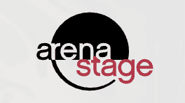
I researched LTA’s competition by reviewing the websites of other theaters in the area, including the well-known professional Shakespeare Theatre, as well as several other local companies. I found that most of these sites featured their current shows front and center and used clean, straightforward interfaces. However, on some of them, the ticket purchasing process was buried behind too many clicks, making it less user-friendly.


Conceptualize
Problem Statements
Problem Statements
Problem Statements
I developed a few POV and HMW statements, which helped guide the formulation of my User Personas by highlighting different areas of concern users might have.
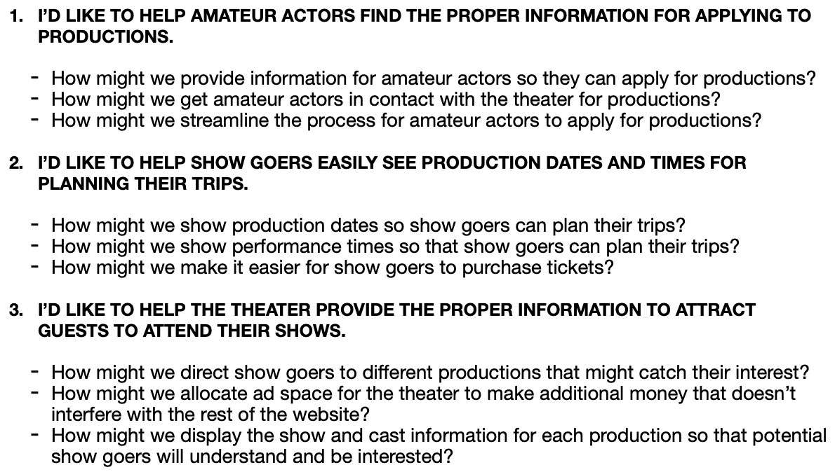
User Personas
User Personas
User Personas
I created two user personas. The first represented the amateur actors I spoke with in the area, who had specific needs such as staying informed about upcoming shows open for casting and requiring a simple, user-friendly interface, especially since some were older. The second persona represented the casual theatergoer. This helped ensure the website was clear and easy to navigate, with a focus on accessible ticket information, showtime calendars, and the smooth functionality of links.


Design
Branding
Branding
Branding
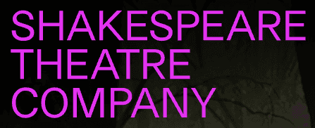
To gain a better sense of a branding direction, I created several mood boards to understand both LTA’s current branding and how the competition’s branding communicated their identity. The existing brand had a lot going on. While it clearly aimed to convey a vibrant and artistic space, the use of blue text created visual confusion. This color was applied inconsistently, with blue used for both sub-menu links and section headers, which gave the false impression that all blue text was a hyperlink. Additionally, the frequent use of different text colors for various placements added to the visual clutter. Competitor brands approached their websites in similar yet distinct ways. The Shakespeare Theatre Company stood out as the most modern and trendy, using neon colors (pink, orange, and purple) to appeal to a younger audience while maintaining a creative vibe. The Warner Theater took a more historical approach, using warmer tones to convey a sense of comfort and tradition. The other two local theaters opted for primarily white backgrounds with touches of red, relying on content to communicate their message. Given that LTA is located in the historically rich area of Alexandria, I wanted to honor its historical roots while highlighting the fact that the theater has been an integral part of the community for 90 years. This led me to choose a more script-style font for section headings and to emphasize their 90-year legacy in the design.
To gain a better sense of a branding direction, I created several mood boards to understand both LTA’s current branding and how the competition’s branding communicated their identity. The existing brand had a lot going on. While it clearly aimed to convey a vibrant and artistic space, the use of blue text created visual confusion. This color was applied inconsistently, with blue used for both sub-menu links and section headers, which gave the false impression that all blue text was a hyperlink. Additionally, the frequent use of different text colors for various placements added to the visual clutter. Competitor brands approached their websites in similar yet distinct ways. The Shakespeare Theatre Company stood out as the most modern and trendy, using neon colors (pink, orange, and purple) to appeal to a younger audience while maintaining a creative vibe. The Warner Theater took a more historical approach, using warmer tones to convey a sense of comfort and tradition. The other two local theaters opted for primarily white backgrounds with touches of red, relying on content to communicate their message. Given that LTA is located in the historically rich area of Alexandria, I wanted to honor its historical roots while highlighting the fact that the theater has been an integral part of the community for 90 years. This led me to choose a more script-style font for section headings and to emphasize their 90-year legacy in the design.
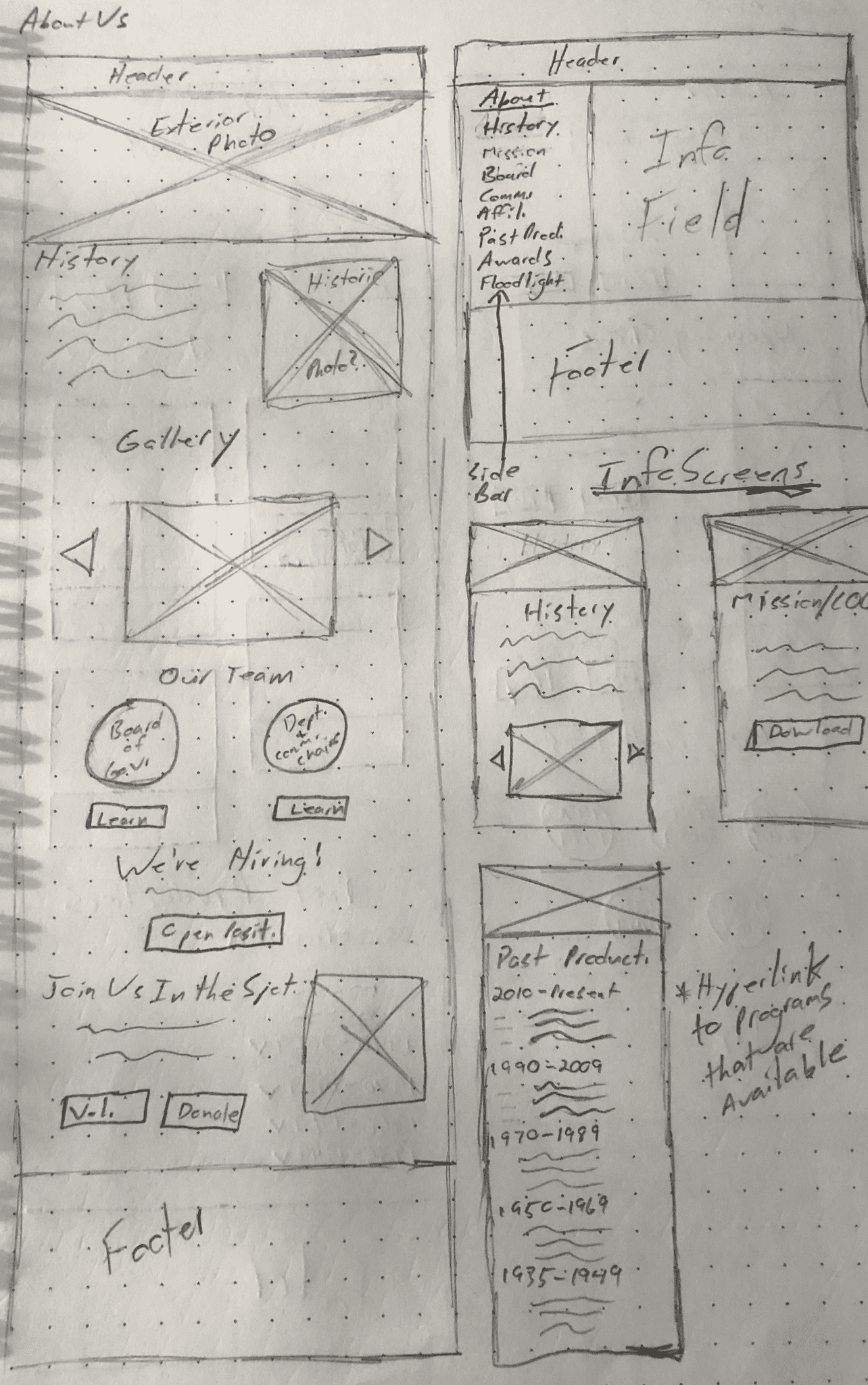
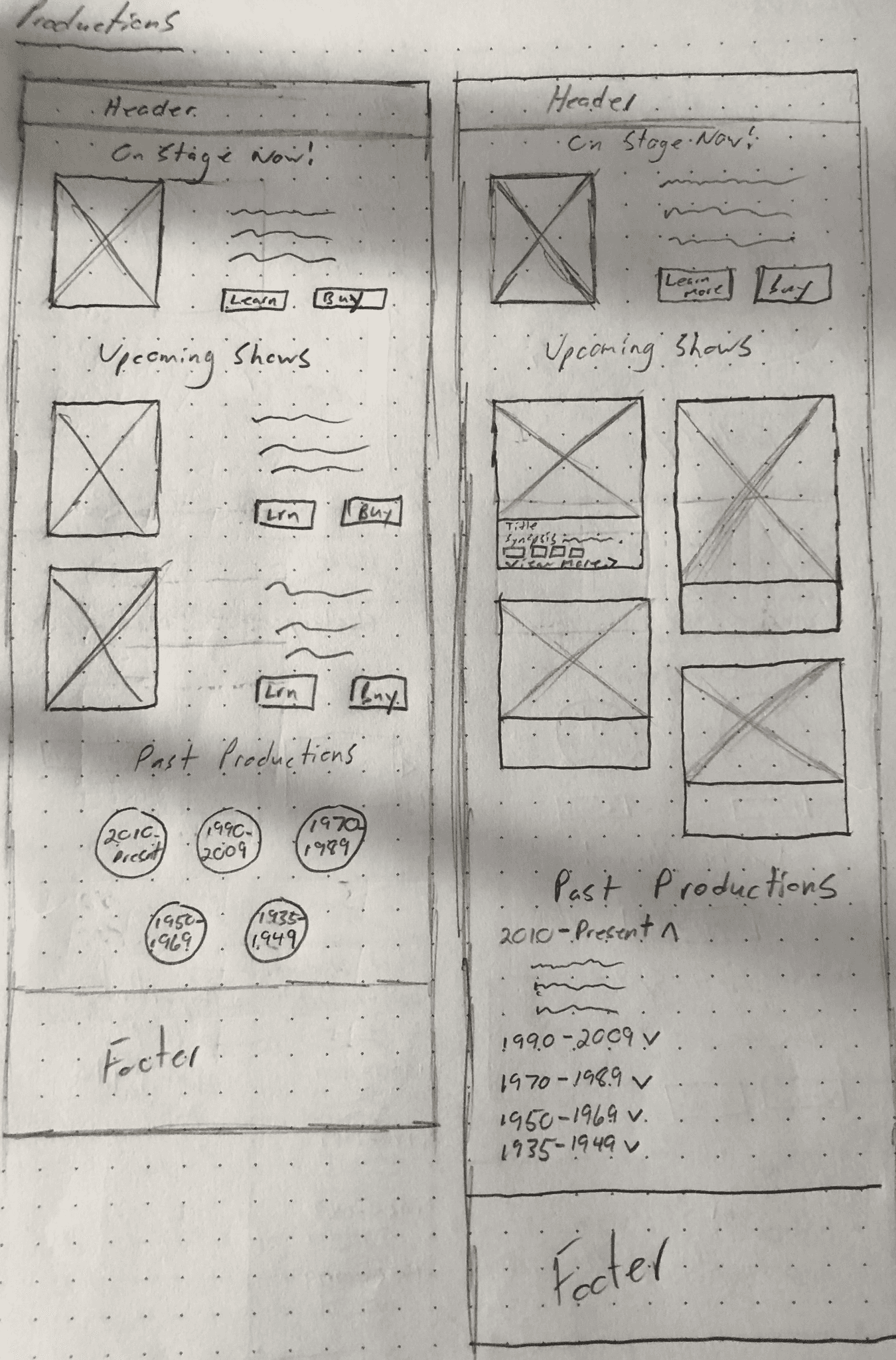
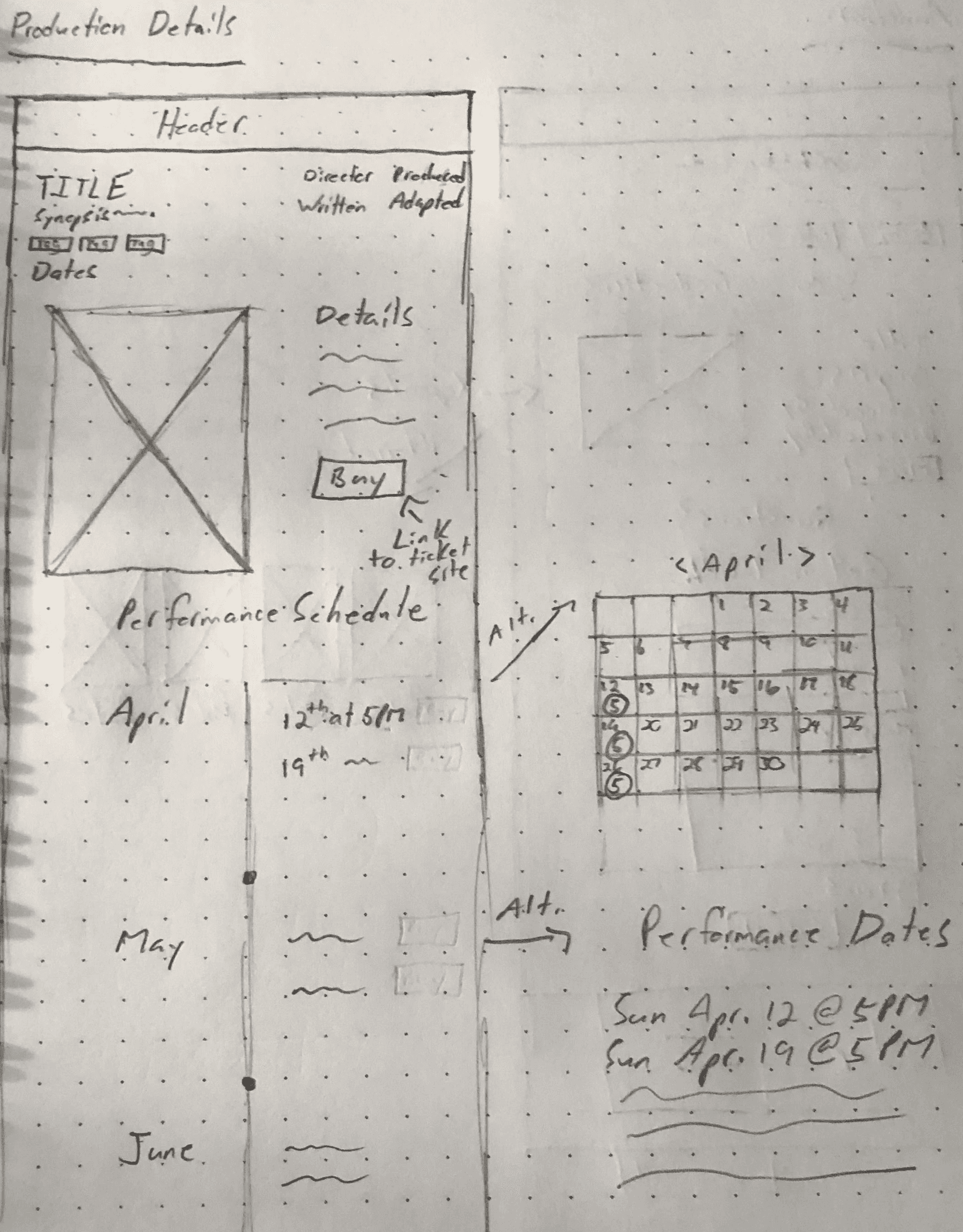
Wire Framing
Wire Framing
Wire Framing
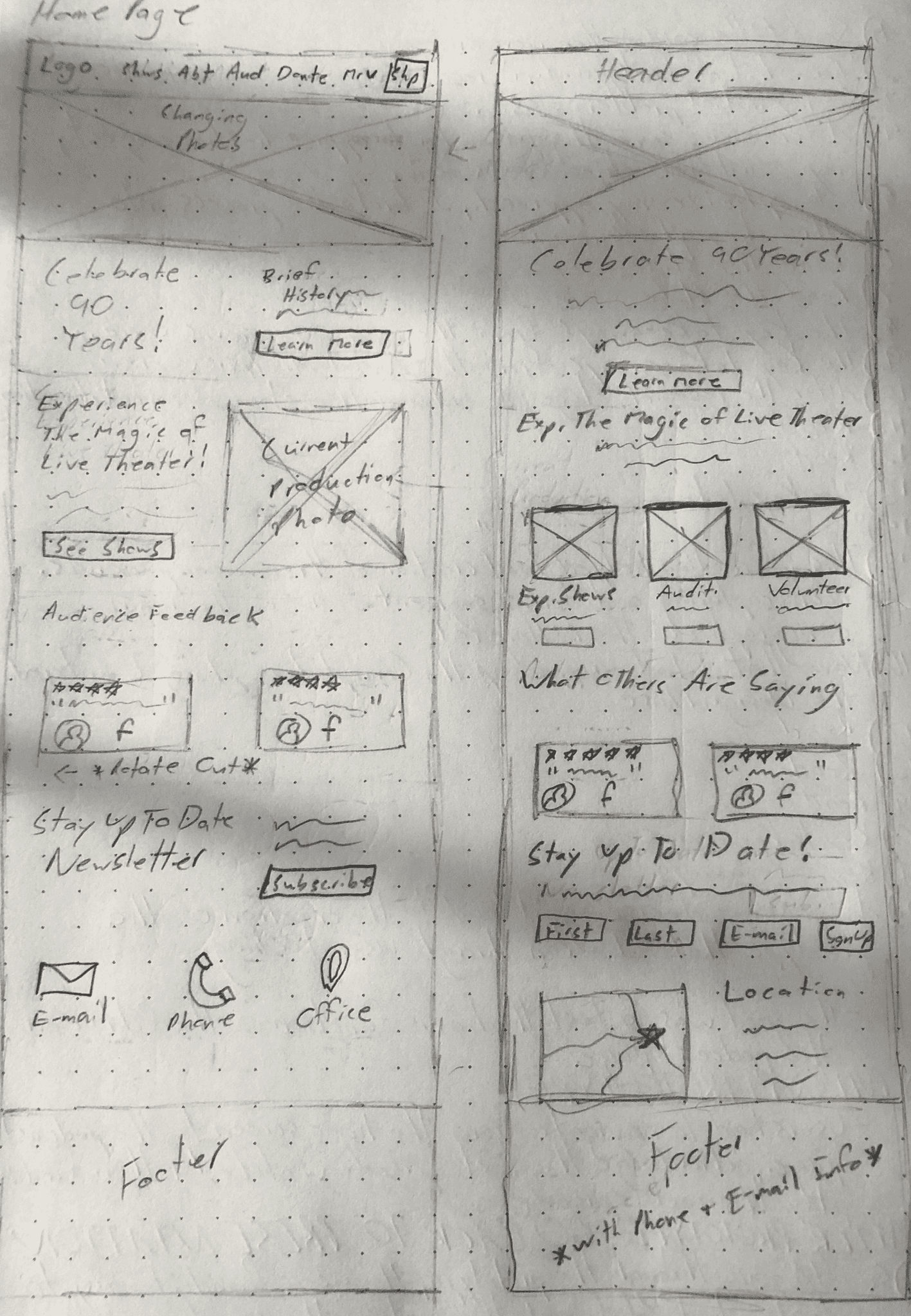
Once I had a clear sense of the brand and direction for the website, I turned to AI for assistance, using the Relume platform to help create a base design for the site. I started by creating a site map outlining the pages I wanted and the content for each page, then had Relume generate medium-fidelity wireframes. From there, I took a step back and worked with physical sketches, creating low-fidelity versions to explore different design ideas before refining the medium-fidelity wireframes.

User Flows
User Flows
User Flows
The current iteration of the LTA website relies heavily on PDF links and third-party ticket sellers. In my user flows, I focused on directing users to these PDFs or third-party sites, with the ticketing process being a key part of the flow. I included the third-party ticket sales platform because it allowed me to make adjustments on the main site, eliminating unnecessary steps and reducing user frustration. I aimed to connect ticket purchasing and show information, as I felt they should stem from the same pages. Throughout this process, I realized the importance of implementing safeguards to prevent users from reaching the end of the process only to discover that tickets were no longer available. To address this, I ensured that sold-out shows were clearly marked on the site, so users wouldn’t reach the ticket site only to go back.
The current iteration of the LTA website relies heavily on PDF links and third-party ticket sellers. In my user flows, I focused on directing users to these PDFs or third-party sites, with the ticketing process being a key part of the flow. I included the third-party ticket sales platform because it allowed me to make adjustments on the main site, eliminating unnecessary steps and reducing user frustration. I aimed to connect ticket purchasing and show information, as I felt they should stem from the same pages. Throughout this process, I realized the importance of implementing safeguards to prevent users from reaching the end of the process only to discover that tickets were no longer available. To address this, I ensured that sold-out shows were clearly marked on the site, so users wouldn’t reach the ticket site only to go back.

Testing
Testing Process
Testing Process
Testing Process
I conducted moderated, in-person user testing to gather feedback on the rebrand and how the pages work together. I chose this approach over a typical "end goal" test because I felt that getting feedback on both the design and the content of the pages was the most critical aspect of the redesign.
I conducted moderated, in-person user testing to gather feedback on the rebrand and how the pages work together. I chose this approach over a typical "end goal" test because I felt that getting feedback on both the design and the content of the pages was the most critical aspect of the redesign.


Outcomes
Outcomes
Outcomes
There were several key areas that needed improvement. One user pointed out that there should be greater emphasis on the summer camps and acting classes, as these are a significant revenue source for the theater. Additional feedback highlighted that the background design wasn’t appealing, and the gradient with the yellow color scheme was visually unpleasing. On a positive note, users agreed that the use of photos was well executed, and they appreciated how breaking up the original site’s wall of text into separate pages helped reduce visual clutter.
There were several key areas that needed improvement. One user pointed out that there should be greater emphasis on the summer camps and acting classes, as these are a significant revenue source for the theater. Additional feedback highlighted that the background design wasn’t appealing, and the gradient with the yellow color scheme was visually unpleasing. On a positive note, users agreed that the use of photos was well executed, and they appreciated how breaking up the original site’s wall of text into separate pages helped reduce visual clutter.
Iterations
Iterations
Iterations
I revisited the color scheme with the help of AI, resulting in a black background with red accents to evoke the feel of red stage curtains. I kept the golden yellow color to highlight page and article headers. After implementing these changes, I presented the site again and received additional feedback regarding the inconsistency of the show images. The "active" show on the homepage lacked a "show card" like the others on the "productions" page, so I made adjustments to ensure it was clearly recognized as a show rather than just a stock image. Another piece of feedback involved the use of grey on certain cards to break up the black background. Some users felt that the solid black background, with minimal contrast between elements, made the overall design feel too monotonous.
I revisited the color scheme with the help of AI, resulting in a black background with red accents to evoke the feel of red stage curtains. I kept the golden yellow color to highlight page and article headers. After implementing these changes, I presented the site again and received additional feedback regarding the inconsistency of the show images. The "active" show on the homepage lacked a "show card" like the others on the "productions" page, so I made adjustments to ensure it was clearly recognized as a show rather than just a stock image. Another piece of feedback involved the use of grey on certain cards to break up the black background. Some users felt that the solid black background, with minimal contrast between elements, made the overall design feel too monotonous.


Final Prototype
After a final round of iterations, I went back and showed it to the former board member and they felt that it was definitely strong enough to take it to the board after elections to present and get further feedback.
After a final round of iterations, I went back and showed it to the former board member and they felt that it was definitely strong enough to take it to the board after elections to present and get further feedback.
Before & After
Before & After
Before & After

Next Steps
Further Testing
Further Testing
Further Testing
Ensure that all features are functioning properly before the presentation.
Ensure that all features are functioning properly before the presentation.
Implementation
Implementation
Implementation
The board elections will take place in the summer of 2025. Afterward, I will reach out to the former board member to connect with the newly elected board and schedule the presentation.
The board elections will take place in the summer of 2025. Afterward, I will reach out to the former board member to connect with the newly elected board and schedule the presentation.
Project in mind?
Let’s work on it together!
Project in mind?
Let’s work on it together!
Project in mind?