
Project Overview
The challenge was to create an app focused on self-improvement. After receiving initial feedback, I decided to move forward with an app centered around physical fitness and diet.
Research
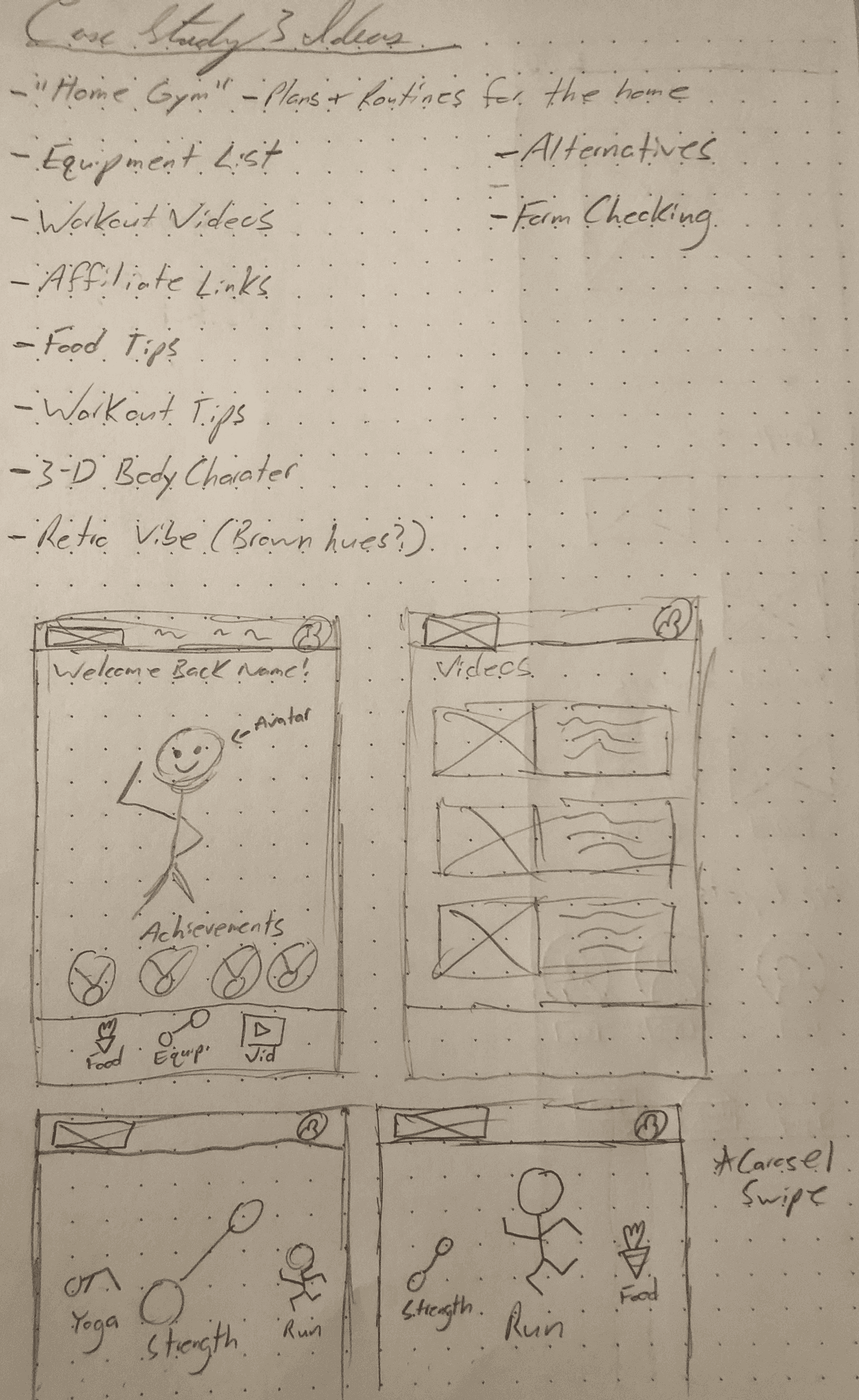
After learning that many users viewed fitness primarily as a combination of exercise and diet, I conducted a focused industry SWOT analysis of fitness apps. What I discovered was that most apps emphasized tracking and personalized planning. However, many of them restricted full access behind paywalls, limiting the user experience.


Conceptualize
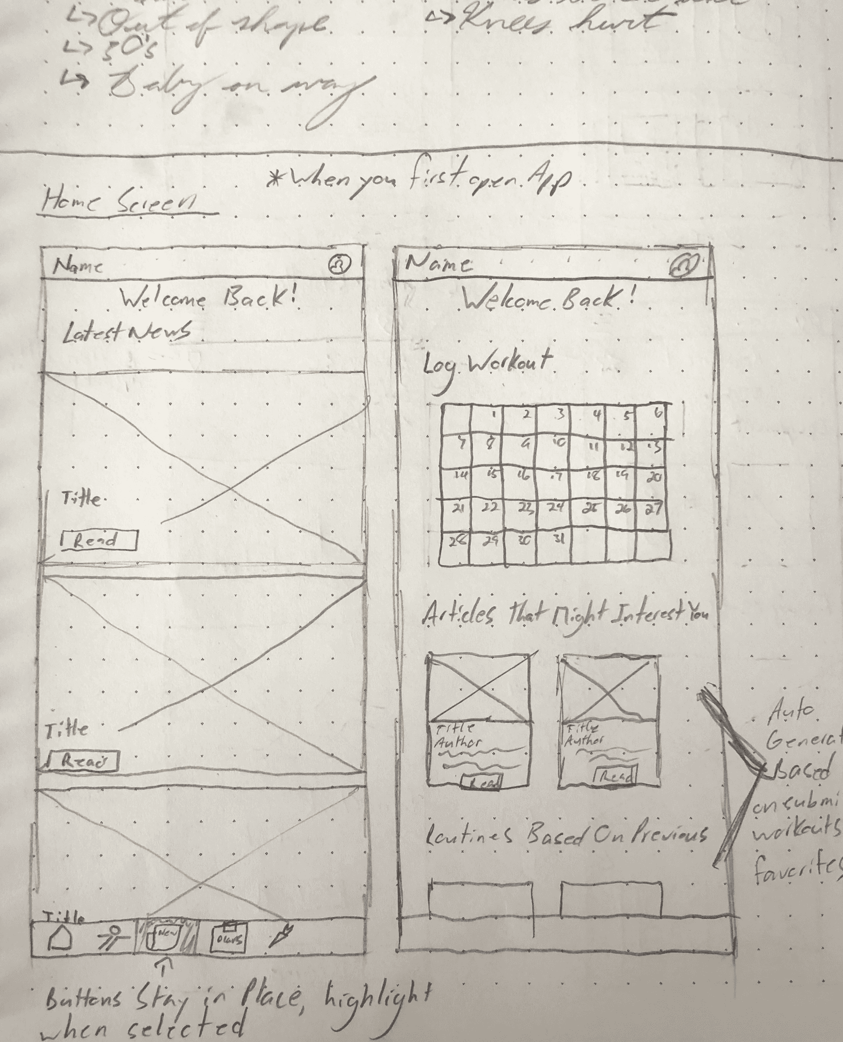
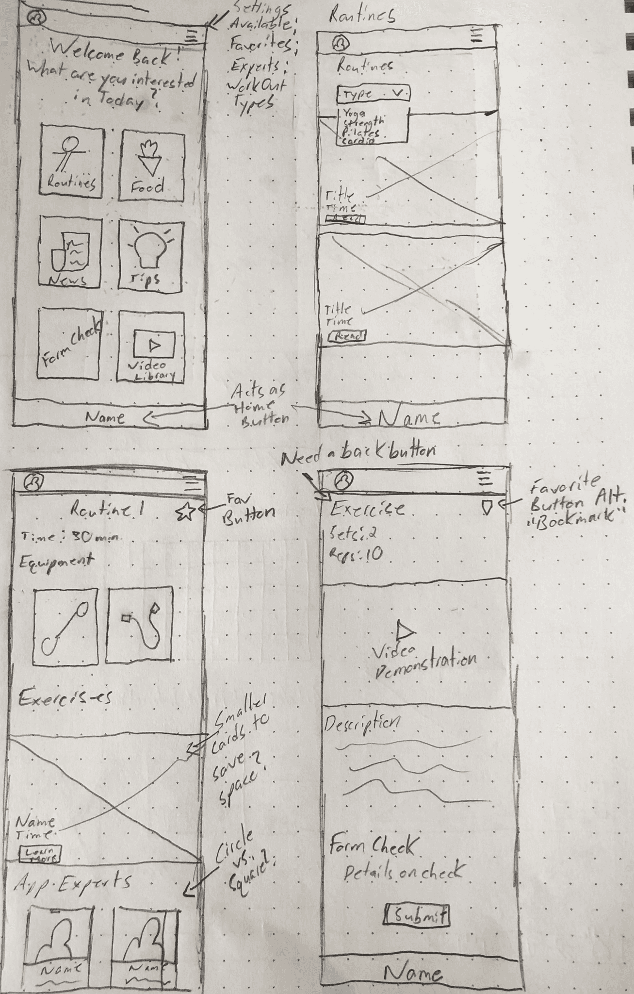
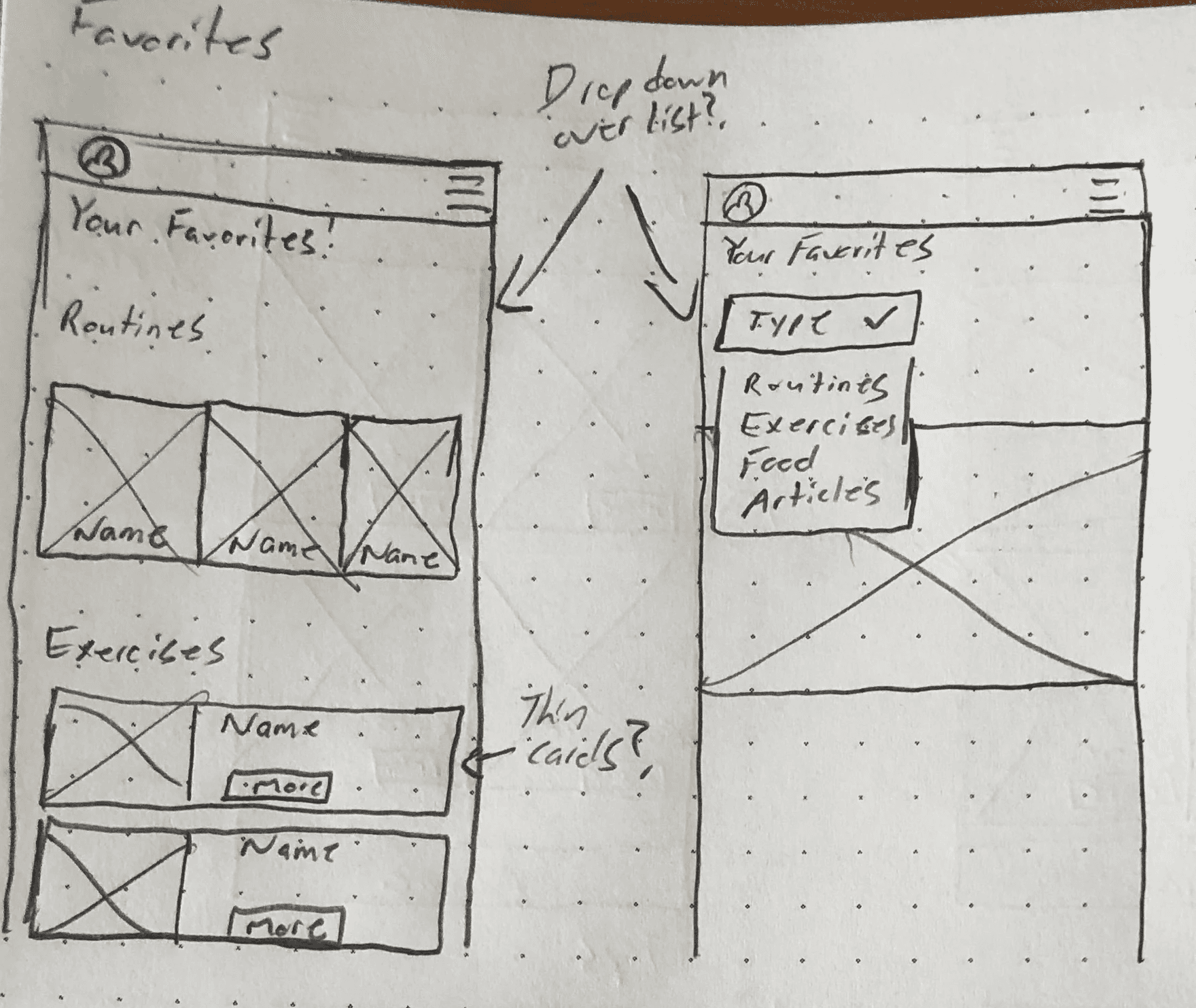
This led me to consider a direction where the app could potentially generate revenue through advertising, while keeping all features free for users. The only functionality requiring an account would be the ability to save workouts and recipes.
To gain further insight into the app’s main focus, I turned to affinity mapping. Through this process, I found that most users’ goals centered around:
• weight loss
• building consistent habits
• maintaining a healthy lifestyle
Many of the users already had support systems in place, so they didn’t see the need for the app to include a social or community component. What they did want was access to better workout plans and a more intuitive user interface than what current apps typically offer.

To help guide the project and serve as a reference point, I created two user personas:
• users who feel like they’re starting from scratch and are looking to improve their overall health
• users who are already physically active and focused on maintaining their current level of health


Design


At this stage, I revisited my subdued color palette and began second-guessing my approach. I knew I wanted green to be the primary color, representing health and renewal. To bring in a more “friendly” and “energetic” tone, I explored incorporating yellow. I also decided to use a white background, similar to what I had seen in other apps, to maintain consistency with industry standards. As I began applying the palette to the mid-fidelity wireframes, I noticed an issue: the design had too much yellow, making it feel flat and lacking the energy I was aiming for. It didn’t capture the vibe I wanted.


After receiving feedback, someone suggested introducing a third color to balance the palette. I tried adding purple, but it only made the design feel overly busy and chaotic.

So, I took a step back and referred to my user personas. I asked myself, “What do both of these users have in common?” For many people interested in health, vitamins and supplements are part of their routine. That led me to explore supplement packaging with a “natural” and “growth-oriented” aesthetic. I found several examples using green and yellow in a balanced, appealing way. Inspired by that, I began experimenting with different shades of green and yellow. I also reconsidered the background. Wanting to maintain a calm, relaxed feel, I chose an off-white background that paired well with the green and yellow tones.

With this refreshed palette, I applied the colors to my prototype. Yellow was used sparingly as an accent in the menu, complemented by a darker shade of green as the primary color. I used white for the cards to keep them neutral, ensuring that the photos featured on the cards didn’t clash or overwhelm the design. This updated color scheme felt much more aligned with the overall design concept I was aiming for.

The name didn’t take long for me to arrive at. I decided to play on the word “Wellness.” Since the app is designed to be a central hub for health information, workouts, and diets, the idea of a “nest” felt fitting—something that suggests comfort, care, and a place to return to. Combining the two concepts, I arrived at the name WellNest—keeping it as a single word and capitalizing the “N” to align with current naming trends.

